As the ecommerce industry within the Caribbean gains strength, businesses are looking at ways to convert more browsers into customers. Conversion Rate Optimization focuses on that shift by examining and tweaking your online sales funnel
Top 20 CRO Tips for Caribbean Businesses
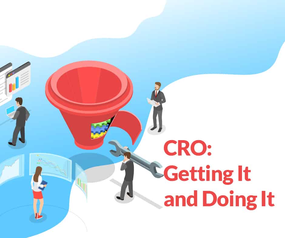
As the fast-developing ecommerce industry within the Caribbean gains strength, more and more businesses are looking at ways to get more people to come to their website – namely, using SEO strategies and techniques to enhance their position in search engines. But equally as important in the world of ecommerce is turning those visitors into customers once they get there. Conversion rate optimization focuses on that shift, and encourages business owners and marketers to examine their online sales funnel and transform those users who drop off early into signed-and-sealed customers.
CRO is a process that starts with a hypothesis, and experiments are then run in order to prove or disprove that hypothesis. According to Brian Massey from Conversion Sciences, there are five areas that can benefit from applying the CRO process: Messaging and Value Proposition, Layout and UX, Credibility and Authority, Security, and Social Proof.
In this article we’ve gathered together some of our top tips that can serve as a starting point for your own CRO process.
1. Get Your Message Right
This includes any wording on banners, your product descriptions, your tagline, your FAQs – it is often worth outsourcing a copywriter to spruce up your website and use language that’s persuasive, conveys a sense of urgency, but remains “on brand”.
2. Base Your Navigation on the Data
Use Google Analytics to discover which products or categories your users are looking at the most, and put those categories first in your menu. The same goes for a footer menu – those static pages need to be based on what your users need most, not just what you think they need.
3. Use Heatmapping:
Heatmapping records how a user navigates around pages on your site, and presents an image that shows the most-clicked areas (based on a sample of visitors). This is a fantastic way to get a true idea of how people are using your site, and can also help you to figure out if your layout makes sense. Some heatmapping services also provide video recordings of actual user journeys, so you can see exactly how someone has used your site as if you’re standing over their shoulder. After watching a sample of these, you’ll get a great understanding of your site visitors, and in particular, any frustrations they might be having.

4. Use Your Homepage for Your Top-Sellers:
Use your ecommerce website software or Google Analytics to determine your best sellers, and bring those to the front of your site. If people can more easily find what they’re searching for (particularly without having to actually search), you reduce the chance that they’ll give up, be distracted, or otherwise not convert. A few of your top sellers or even best-selling categories being right in front of the customer can make a big difference to your conversion rate optimization exercise.
5. Remove Navigation on Landing Pages:
Conversion Rate Optimization is full of studies, and one of the often repeated findings is that navigation on landing pages confuses the user journey. A landing page has a singular purpose, and anything else on that page that isn’t the Call-to-Action (CTA) is a distraction, and could mean a user doesn’t convert.
6. Show Product Variants as Options, Not New Products:
Some sites have multiple entries for the same product that is sold in a different color or pattern. However, Google sees these different pages as having virtually the same information, and therefore, will read it as duplicate content, which is a negative in terms of SEO (search engine optimization). Customizing your product descriptions to your business will alleviate any similarities to other sites selling the same or similar products, and having sizing and color differences as options or variants rather than separate products will remove the likelihood of duplicate content on your own site.
7. Keep Your Goal Front & Center
Be aware of the importance of the real estate on your site. You can’t feature every product, but equally having things like overly complicated menus, out of date banners, and ads at the top of your site makes it much less likely that a user is going to buy from you. Keep it to the point, hide menus for mobiles, and push less important information lower on the page. Most importantly, don’t hide your primary call-to-action.
8. Offer a Secondary Conversion Option:
If a user isn’t quite ready to buy from you, give them another option that can potentially convert them further down the track. This could be a pop up on exit intent (when a user goes to leave your site) that offers a discount code or newsletter sign up (with some sort of incentive for the user obviously) or even just taking advantage of remarketing tools, so you can advertise to them when they’re next online.
9. Check Your Page Load Speed:
Research shows that 53% of users will abandon a mobile site that doesn’t load in under three seconds. If a user isn’t hanging around to wait for your site to load, they definitely won’t be converting. Use Google’s PageSpeed Insights to look into how quickly your site loads, and implement its suggestions for improvement (usually things like avoiding page redirects, optimizing images, removing unused CSS, minimizing code).
10. Offer & Highlight Free Shipping:
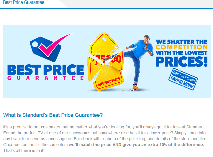
Shipping costs are one of the most important factors in a user’s conversion journey. If you do offer free shipping, make it abundantly clear (with a small banner in the header, for example). If you can’t offer free shipping, present the fact early and clearly, and include a link to an FAQs page (or delivery/shipping information page) so that you can clarify your sales funnel from the start.
11. Simplify the Checkout Process:
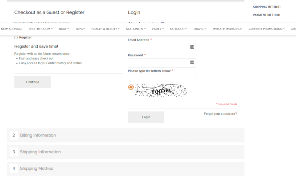
If you have a multi-step or multi-page checkout process, look into making it shorter and single-page. Is there any unnecessary information on your checkout page? Can you hide the billing details if they’re the same as the shipping details? Do you really need a home, work, and mobile phone number? Keeping the user’s cart details at the top of the page eliminates the need for an extra “This is your cart” step.
12. Reduce Form Fields:
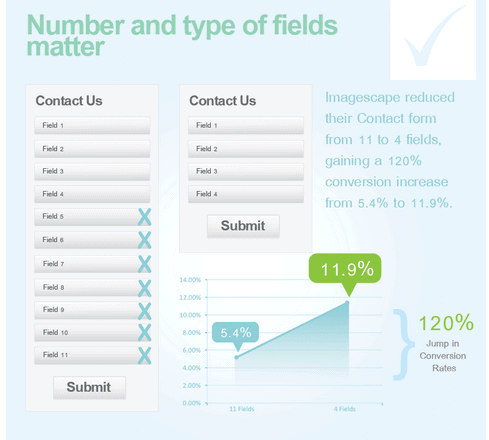
Whether for ecommerce or any type of completion, form fields can have a huge impact on your conversion rate. The studies are clear in that forms with too many fields are overwhelming for users, and they are much less likely to even begin filling something in if it looks like the business wants too much information, or if it’s going to take too long. Think about what you really need from the user at this stage in your funnel – do you need to know their occupation? What’s relevant to you now, and what do you need to know later on? Perhaps you only really need an email address. Keep it short.
13. Include Auto-Suggestions in Your Search Bar:
This is a great way to help your users find what they’re looking for without having to type in the whole thing. It also allows you to show some of your other products at the same time, so a user has a sense of your range and any other products they may need within the same shop.
14. Use Trust Signals:
Icons in your site footer that highlight that a customer will be safe shopping with you have a clear positive effect on conversion rates. Images like “Secured by VeriSign”, “Powered by First Atlantic Commerce”, or “Verified by Visa” can mean the difference between a sale and no sale.
15. Add a Sense of Urgency to a Conversion:
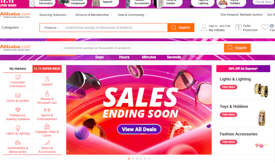
The longer it takes for a customer to buy, the more chance they have of taking their business elsewhere or talking themselves out of the sale. Adding details like “Only 5 left!” or “Sale ends in 3 hours” can encourage users to convert.
16. Include Social Proof (Customer Reviews):
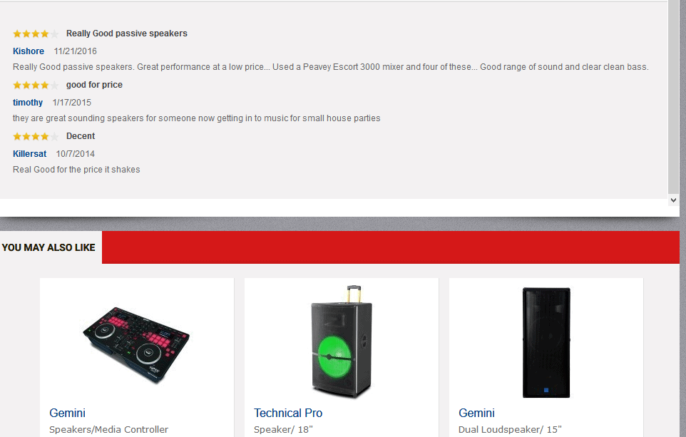
Reviews of your products by their peers can have a significant impact on a user converting. Research shows that products with 10 or more reviews have a 54% higher conversion rate than those with none.
17. Display a Prominent Promo Code:
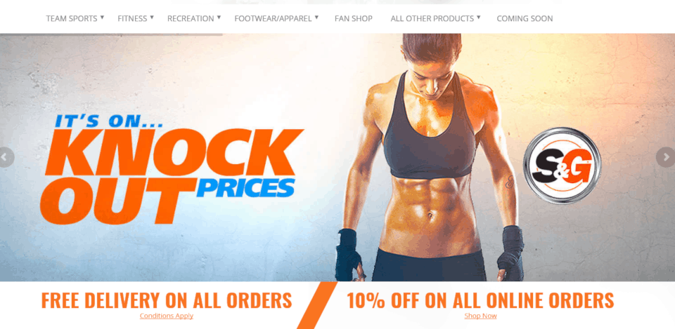
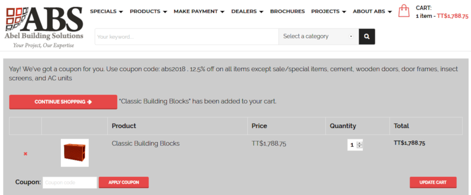
Promo, coupon, or discount codes are extremely effective ways of making a sale. If a user feels that they’re getting a good deal, they’re much more likely to buy. However, many savvy users will look for promo codes before they complete a purchase, and if they can’t see one on your site, they’ll try and find one somewhere else. If you can lead with a promo code (in a pop up or a banner), they’ve already made the psychological leap that makes them feel like they’re getting a bargain.
18. Optimize Your Landing Pages:
Dive into Google Analytics’ Landing Pages report and look at the first pages that people are visiting on your site (these are not necessarily the same as your ‘offer’ pages or those that you’re promoting via Google Ads, for example). Check out their bounce rates, exit rates, conversion rates, and the queries that people used to get there. Does the page answer the user’s query? Is there anything you can do to bring them further into the site, or get them to convert earlier? Examples might be removing multiple calls-to-action; implementing a pop-up on exit intent; shortening and clarifying forms; improving the language and making your value proposition really clear.
19. Personalize Your Offering:
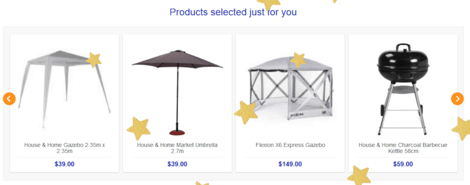
Using your content management system, adapt the products you showcase or promote based on the individual user. This can be as straightforward as a “You recently viewed” section, which allows a customer to return to products they’ve looked at within the last couple of sessions, to individual product remarketing, to cart abandonment emails.
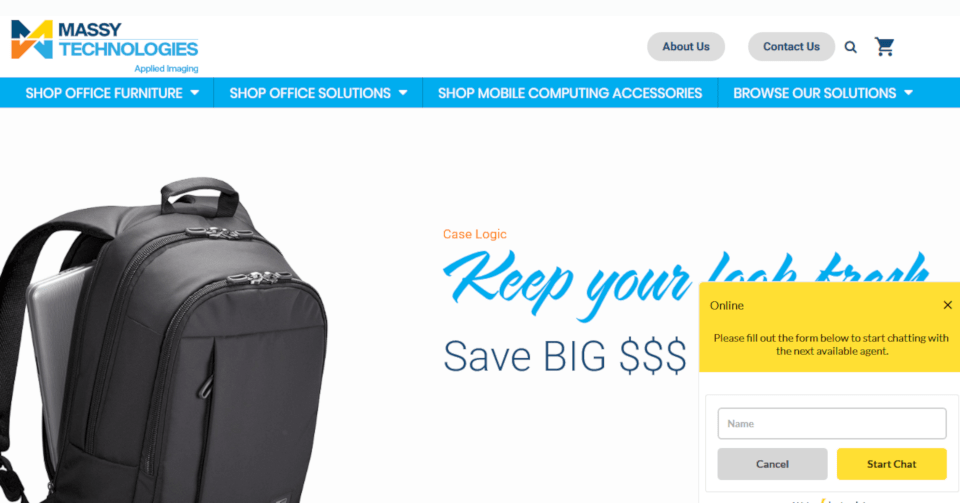
20. Add a (monitored) Chatbot:
Simply having a customer service representative on hand to answer any questions via chat can be a simple and effective way to reduce any friction or doubts that a potential customer may have. Some users find it easier to simply ask for help (as in a bricks and mortar store), or others may not know where to look on your site to find the information they’re searching for. There are many easy-to-use chat software systems that can head off any concerns straight away.
The Takeaway
Conversion rate optimization is a long-term process, and something that needs to be worked on and tweaked throughout your website’s lifetime. But paying attention to how you can better serve your customers is a vital first step in improving that conversion rate. And how do you know you’ve improved? As Peep Laja (founder of ConversionXL) notes: “A good conversion rate is better than what you had last month.”
HAVE QUESTIONS ABOUT YOUR NEXT PROJECT?

