
Over 60% of customers want their bank to be as personalized as Amazon or a personal shopper.
As we usher in the digital revolution, individuals’ lives are becoming highly centred around technology and digitally enhanced experiences. This process of digitalization means that many operations, from dating to shopping, have moved to the digital realm. As the Caribbean joins this transformation and expands its take-up of digital services, financial institutions have joined the process of offering services online. Currently, most persons enter a physical financial institution a few times a year but interact with them through mobile devices up to 20 times a month. With this technological accessibility, each exchange is an opportunity for financial institutions to gain more insight into their customers and optimize operations all while increasing revenue.
Despite the obvious evidence of individuals increasingly interacting with financial institutions online, there are many barriers that hinder a customer from converting and completing processes online. It may surprise you to know that the credit and lending industry has the second-highest lead generation conversion rate across all industries (the first being job training). At 5.6%, this still means that nearly 95% of users are not converting, leaving ample room for improvement. As a financial institution operating in 2023, it is critical that all touch points of your operating systems are optimized effectively to achieve the highest conversion rate possible.
After over 10 years of research and experience with multiple financial firms, we have compiled six key factors that should always be prioritised when attempting to increase your conversion rate.
Site Security/Safety
When customers are requested to hand over their most personal information over the internet, it’s only natural that they would expect it to be treated with the utmost integrity. Displaying trust logos from institutions like Norton shows customers that you care about their data and would never let it be compromised. Adding guaranteed reimbursement is another layer of security that is reassuring. This ensures that if an individual’s information is compromised during transactions on a financial institution’s platform that they will be repaid in full what was lost if any.
To add an additional layer of security customers can be reassured that their inquiry will not affect their credit rating, which is often a concern for people filling in finance applications. Even if this does not reassure your customer, guaranteeing reimbursement will remove any remnants of uncertainty.
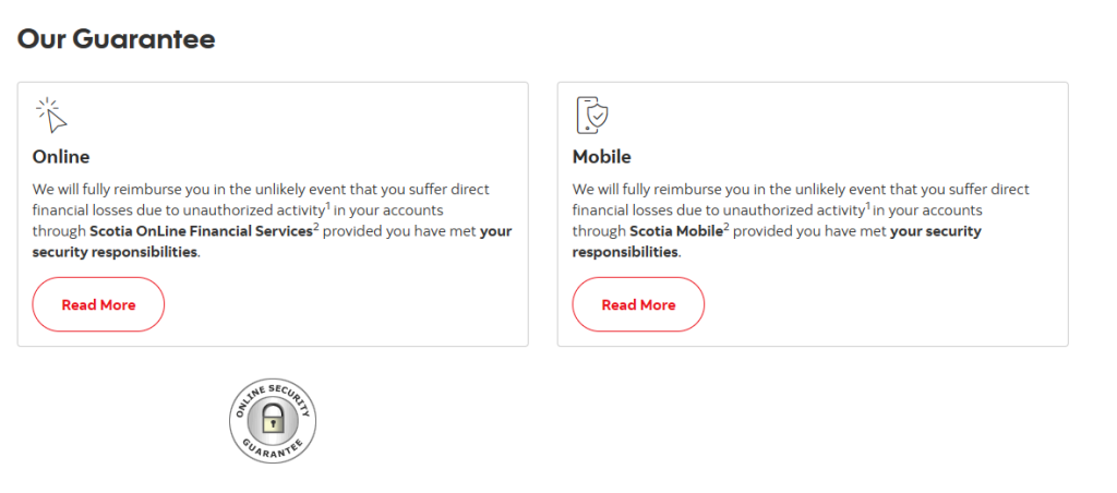
Scotiabank’s online security guarantee
Forms
Although the banking industry holds a huge advantage over other sectors as customers already expect to share personal information in length, long and unclear application forms can significantly affect your conversion funnel. The average online form abandonment rate for financial services currently stands at 79%. The number one reason for abandonment is lengthy forms while the second reason is that forms require too much personal information from customers.
Optimising Forms
- Create forms that are short, to the point, and only request essential information needed at that point in your customer relationship.
- Indicate the length of time that a form will take to complete and the information that is required before
- Utilise a progress indicator to show how far along customers are in the form process
Include a feature that allows customers to save their application and complete it later. (Email re-marketing can be implemented to close up the funnel).
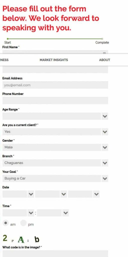
Forms similar to the one above require a lot of information that might be off-putting to a customer at this early stage of the funnel
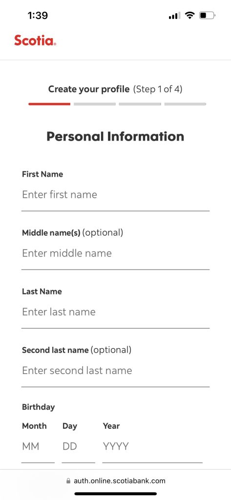
Scotiabank indicates authorized browsing while highlighting numbered stages of the application form

Confused.com offers complete transparency by including the estimated time to complete the form on the green call to action button
Optimise Your Landing Page for Your Goals
To translate your goals through website updates it is key that all efforts work in tandem with each other. When using advertising to attract customers, ensure that the advertising and landing page are connected. One of the main causes of a low conversion rate is ads that lead to home pages with unrelated offers or information. This not only results in disappointment for the customer but also for the advertiser as the ad will not achieve adequate leads.
Maximize ad spend by creating a new landing page for each individual offer and focus your ads on that offer alone. Implementing a single call to action for your landing page leaves the customer in no doubt as to what they’re expected to do and how they will benefit from doing so.
Conversion rate optimisation can also be enhanced by testing your landing pages to ensure the best user experience possible. This includes, but is not limited to, form positioning, wording (particularly for a call to action), colours, and copy quality.

Republic Bank’s Google Ad and subsequent landing page – is this a loan application like the landing page states, or is it a competition, as shown in the ad?
Use Micro Conversions to Get People In
Not every customer will be ready to convert and meet your application goal within their first few visits to your site. These customers need to be nurtured through a pipeline and encouraged to build a strong connection with your business through micro-conversions, like signing up for a newsletter, downloading more information about the product, or using a finance calculator. The most important thing is establishing that first connection with the customer, and ideally, getting their email address so you have the opportunity to approach them further down the track.
Optimise for Other Devices
With the rise of mobile devices, it’s more important than ever to ensure that your customers have a positive experience when they visit your website on any mobile device of their choice. Customers now expect tailored experiences across multiple channels with privacy embedded throughout. By making your site responsive they will have the same experience in terms of look and feel across devices, which helps with your branding recognition and usability.
Even though most data indicates that individuals are less likely to complete a long application form on mobile, the only way to guarantee results is to use your analytics data to discover how your customers interact on your site and what visit your site to do. Is it find out more about your products? Is it only to use mobile banking? What demographics are accessing your site from their mobiles? What do you know about them, and how could you market to that age group/gender specifically?
Use the data collected to inform the optimisations you make. If they are completing forms, ensure the site is optimized for mobiles – larger form fields, optimized images, and the correct input types. If they need to put in numbers, change the input type to numbers so the keypad adjusts.
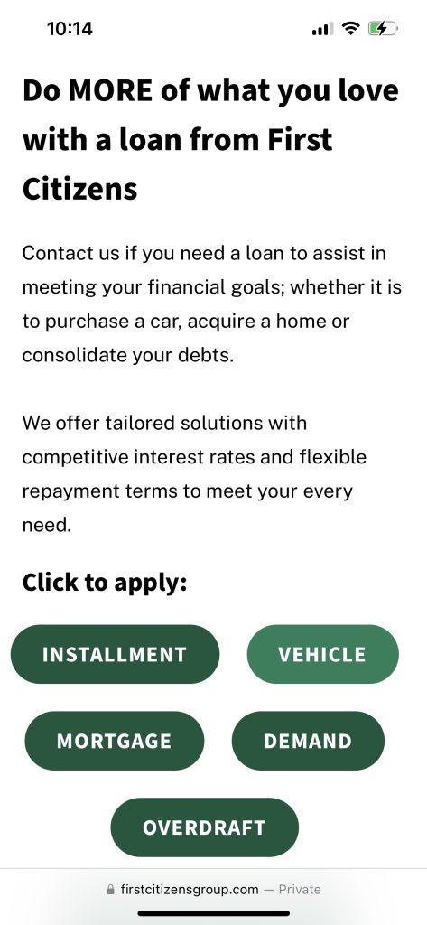
First Citizens Bank optimizing its website and application forms for mobile
Get Ready for Personalisation
Over 60% of customers want their bank to be as personalized as Amazon or a personal shopper. Even though personalization is not a one-step process and is more about program integration, financial institutions that implement a more personalized user experience notice an increase in revenue. Mckinsey’s survey on personalization performance revealed that institutions that practice basic levels of personalization can expect to notice lifts in revenue by 5-10 and a full 25% growth when a full transformation is accomplished.
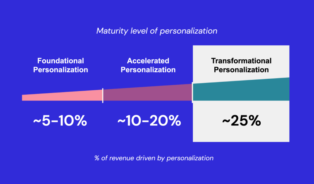
McKinsey’s Survey on Personalisation
Personalized emails for product offerings, online advice, and service information strengthen the connection between your business and your customer. This bridges the gap between all client touch points and allows institutions to effectively target the user with offers based on their past interactions.
McKinsey’s study found that personalization can reduce acquisition costs by as much as 50%, inflate revenues by 5 – 15%, and increase the efficiency of marketing costs from 10 to 30%.
By integrating third-party data into its CRM processes the Credit Union of Texas was able to learn more about its site visitors and create more personalized messaging. Investing in segment-specific data to aid in customization for returning and acquisition targets resulted in a 300% increase in home equity and mortgage applications, a 20% increase in auto loan leads, and a 15 million growth in total submitted loan leads in the first month.
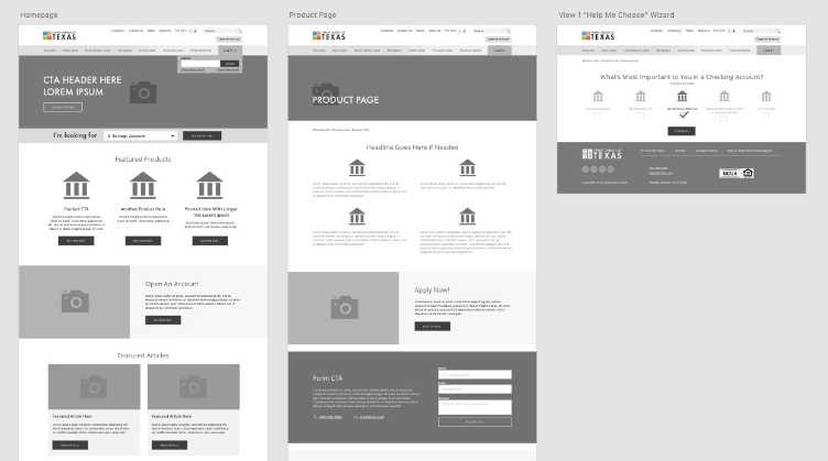
The Credit Union of Texas personalized CTAs on the back end to increase leads during the customer’s journey.
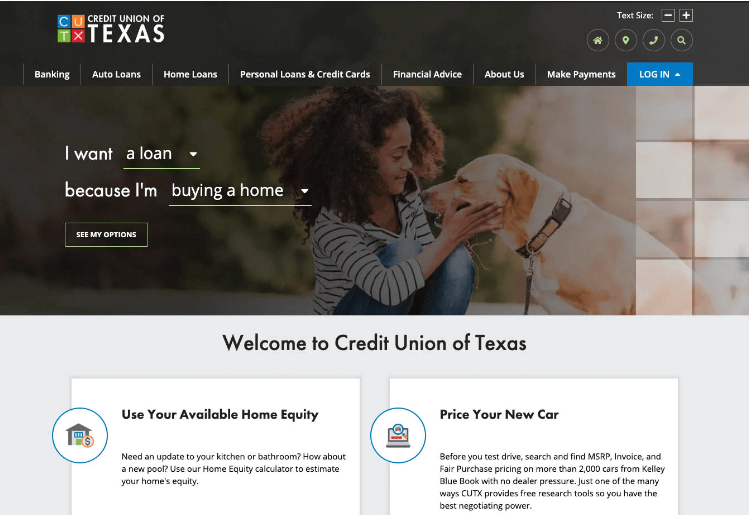
Personalization translated on the front-end
With careful planning, testing, and implementation, credit institutions can harness customers’ inherent trust and understanding of the nature of banking to hit their own goals – which is the website’s primary purpose.
Financial institutions that take up the challenge of tapping into conversion rate optimisation and achieve end-to-end personalization will develop a significant advantage over their competitors and create a unique lane for themselves that is impenetrable.


